|
|
Post by Simply "V" on Sept 23, 2007 23:17:21 GMT 1
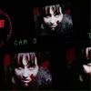
Tell me what you think please. If you see any room for improvement please let me know. Thanks.  |
|
Fayee'.
Energetic Enthusiast
 Trying to catch your heart is like trying to catch a star,(:
Posts: 248
|
Post by Fayee'. on Sept 24, 2007 17:13:56 GMT 1
Maybe set the picture settings to a higher qualitly when your in the sims, so then you can get a better picture?
|
|
|
|
Post by summer. on Sept 24, 2007 19:28:05 GMT 1
Hmm... I like the expression... But it looks a little choppy around the hair, that might just be my eyesite though. I've been staring at a computer for 3 hours  |
|
|
|
Post by Simply "V" on Sept 25, 2007 2:08:47 GMT 1
hmmm, the picture quality was good to begin with; seems I've been over editing again. I'll have another go - thanks guys  . |
|
AJ
Posting Prodigy
Posts: 454
|
Post by AJ on Sept 25, 2007 4:39:10 GMT 1
It is kind of crunchy, maybe blur it until it's less so. Also, I don't like ingame pics. From now on try taking print screens, and then you can crop/resize them. You'll get a much better quality. The background is pretty dark, and then there are the little patches of things than I can see. I'd either make it so you can see everything or total darkness. That's all I can think of at the moment.
EDIT: Summer's right, the hair does look kind of choppy. Try selecting bits of it and deleting them until it looks smoother.
|
|
|
|
Post by Simply "V" on Sept 27, 2007 1:40:08 GMT 1
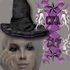
Hopefully this edit is an improvement. I took your advice and blurred the image while smoothing the edges of her hair etc., tell me what you think? Also, which text do you prefer? Thanks again for your help .   |
|
|
|
Post by gems on Sept 27, 2007 7:29:33 GMT 1
To be honest V i think it would be better with a different pose from Charlie, one with her maybe looking at us...? i love the title though, how you put the image of the broken heart instead of the word is just perfect |
|
|
|
Post by *~*Alia*~* on Sept 27, 2007 10:05:47 GMT 1
I like the second title, but the hair still looks very sketchy. The black background is nice, but it's a little plain.
|
|
|
|
Post by summer. on Sept 27, 2007 12:03:21 GMT 1
Yes, I agree with gems
Maybe a different pose, but the second text title is fab.
|
|
|
|
Post by Simply "V" on Sept 28, 2007 2:34:20 GMT 1
Okay, I tried a totally new layout....*crosses fingers*  btw ~ Thanks for your honesty guys, I really appreciate your help . |
|
|
|
Post by *~*Alia*~* on Sept 28, 2007 2:50:26 GMT 1
This one's great! I really like it, nothing in particular I would change.
|
|
|
|
Post by Clauds on Sept 28, 2007 3:53:16 GMT 1
Can I be very annoying and say I liked the idea of the first pic better? don't get me wrong, the second's graphic quality is 10000% better and the layout is lovely, but the pose on the first seems more dramatic (and I love the drama  )... maybe placing her a bit more to the corner and adding a very suttle gradient layer for some shading? Sooo sorry, I bet you want to hurt me now  |
|
|
|
Post by gems on Sept 28, 2007 7:14:38 GMT 1
i really love the new one though i also agree with Clauds that the drama of the older versions was better....
perhaps a mixture of both? i dunno...covers have never really been my thing lol
|
|